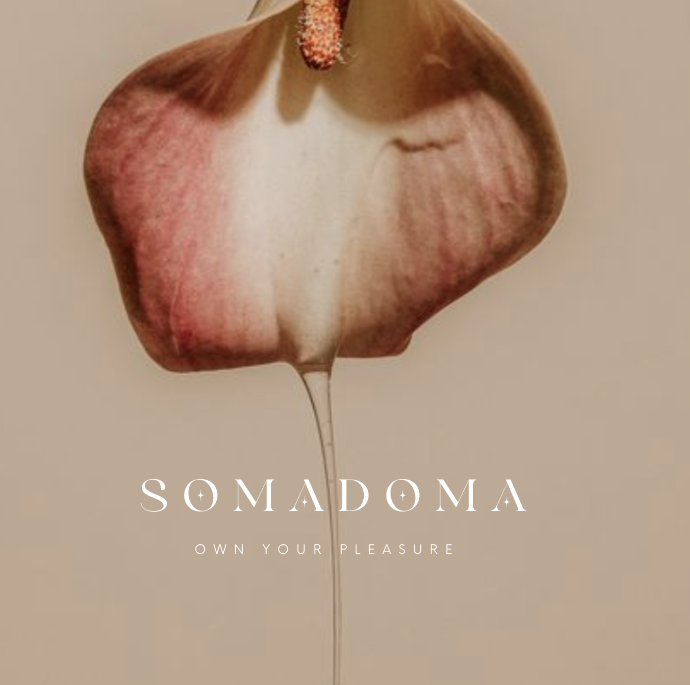
Case Study: Somadoma
Luxury Brand Identity for a Sex-Positive Space in Florida
Client: val kolbynik, sex therapistWhere elegance meets empowerment.
Somadoma isn’t your average sex shop. Founded by licensed sex therapist Val Kolbynik, this LGBTQ+ inclusive boutique was created as a healing space—where women and non-binary people could explore intimacy, pleasure, and self-connection without shame.
The challenge? Design a brand that would pass city council approval while feeling more Prada than roadside novelty store.
This wasn’t about buzzwords or cheeky taglines. Somadoma needed to feel luxurious, safe, refined—and above all, respectful.
My Role & Responsibilities
Brand strategy + positioning
Visual identity system (logo, color palette, typography)
Design direction for signage and store presentation
Professional presentation for city council approval
Brand Design
Strategy
Objective: Establish a polished and elevated visual language for Somadoma that could:
Distance itself from outdated, hypersexualized sex shop tropes
Communicate luxury, safety, and healing
Appeal to women, non-binary people, and LGBTQ+ communities
Pass approval by the local city council for a brick-and-mortar presence
I approached this project like branding a high-end skincare line or boutique hotel: clean lines, elegant serif typography, rich neutral tones, and intentional white space. The visuals needed to invite curiosity without being explicit, creating a sense of discretion and refinement.
Strong anticipation for the brick-and-mortar opening in the local community
Positioned as a disruptor in the adult retail space
Established a unique niche as Florida’s most elegant, inclusive sex-positive brand
Results
Tools Used
Adobe Illustrator, Photoshop, Lightroom, InDesign
Canva (for templated rollout assets)
Google Slides (for official city presentation)
Notion (File organization, Project Management)
Long-Term Impact
The Somadoma brand identity now serves as the foundation for:
Future in-store collateral (signage, product tags, menus)
Packaging design for custom product lines
Social media design templates
Marketing campaigns focused on empowerment and education
Takeaway
Somadoma proves that sex-positive branding doesn’t have to be loud or lurid—it can be stunningly sophisticated. By leaning into elegance and restraint, we created a brand that feels like luxury skincare but stands for sexual healing.
Interested in building a brand experience this unforgettable? Let’s talk.
Ready to launch a brand that gets you noticed?
Click below to apply


